
Illustrated Fun Run Map
The Project
In February, the Resident Manager of Cuchara Valley Recreation, Rebecca Maguire, reached out to me about a dream project: illustrating a fun run map! She said that this was something she'd been wanting to do for years, and it was finally time to pull the trigger!
We discussed the necessities: race route, race markers, location descriptors, map size, and more. She encouraged me to flex my illustration skills, include wildlife drawings, and little details of the area that the locals would enjoy spotting. She said the map would go on their website, social, and would be printed out for the racers. Lastly, she needed everything by May so she could have time to promote the race and map on web and social.
Now it was time to begin!
Inspiration


Rebecca kindly sent over a big Pinterest board full of illustrated map ideas. Some were city maps, others were wedding venue maps, best food maps, national park maps, etc, etc.
The elements I especially loved and took inspiration from were:
The small pockets of illustrations that fit between the street blocks
The intention behind deciding what needed to be included and what didn’t. This wasn’t a perfect representation of an area — it was a representation of what I deemed was important for this specific map.
The hand-lettering! The confidence of it not being perfect.
Reference Images


Because the race was taking place in Colorado and I lived in Georgia, Rebecca sent over a huge Google Drive folder of notable landmarks, the race route, and other visual elements that might help in my map-making.
Sketching
I started off with this free-hand sketch in my work notebook, just to brainstorm the look and feel of the map. Although it was terribly messy, it got to the heart of the idea. From here, I was ready to work on big paper.


I taped together two 9x12 sheets of paper for an approximate 11x17 sketch. There was plenty of extra space on the bottom, so it was easy enough to edit the piece to a more exact size on Photoshop once the sketch was complete.
Line Art

I was obnoxiously determined to have the sketch on one page —- no matter the mistakes, eraser marks, or areas redrawn a million times. When I received feedback for the initial drawing, I decided to erase the mistakes directly on the paper and draw again.
Usually, I would draw on a separate sheet, cut out the changes, and glue it down on the initial paper. Or, I would draw on a separate page, scan it separately, and composite everything on Photoshop.
But with this piece, I felt like it was important to be able to visualize everything in one glance while it was still on my drafting table.
Some of the requested changes included:
adding a few roads
correcting the look of the mountain range
updating the race route
moving the community center into its correct position
adding the tennis court

Full Color Drawing
I printed out the line drawing on 11x17 tabloid paper at Staples, and used a Lightbox to trace the lines on a separate sheet of 11x17 Bristol paper.
My first attempt included painting the entire background a blue-ish green color. It was a huge mistake, so I started over again.

I don’t have many process pictures, mostly because I wasn’t sure if it was working. The entire time I was drawing, I was hoping and praying that eventually it would turn out how I wanted. Sometimes drawing is difficult like that.

At this point — when it was almost complete — I was finally able to see that things were turning out how I wanted them to!
For the full color drawing, I was worried about the messiness of the handwriting, so I wrote all the text for the location markers on a separate sheet of Bristol paper.
Because my scanner was starting to die on me — and because I didn’t want to scan this in pieces on my 8.5 x 11 scanner — I scanned these drawings at Fedex for a total of $1.35. (Fedex scanners are better than Staples scanners).
Thankfully, because of all this work on the page, only very minor Photoshop edits were required!
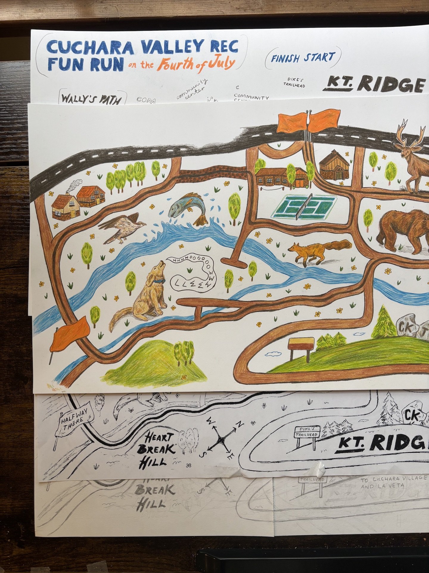
Final Art

I had been considering lightly coloring areas of grass between the roads, just so break up the blankness of the background. In the end, I was too worried it would ruin everything. However, thanks to Photoshop, I was able to test out those changes in post.

Social Elements
I had an idea for an animated promo for the map, and bang — I had to do it. I couldn’t help myself.
Beyond that, I also created a simple social graphic!

All-in-All
This was SUCH a fun project to work on! I’m so thankful to Rebecca for thinking of me for this. I can already tell that this project will go down as one of my favorites of my career.
Looking for a race map of your own? Drop me an email at joyaliciaraines@gmail.com so we can discuss your project!